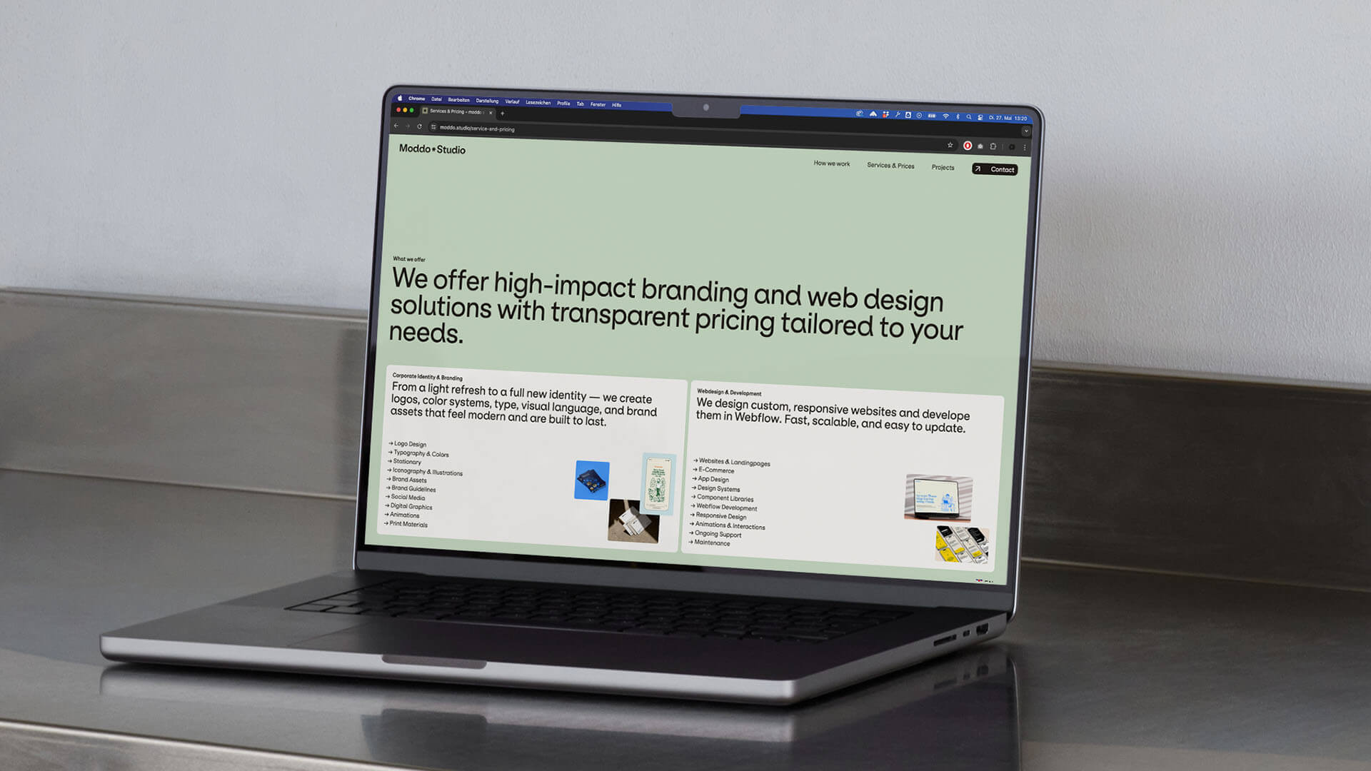
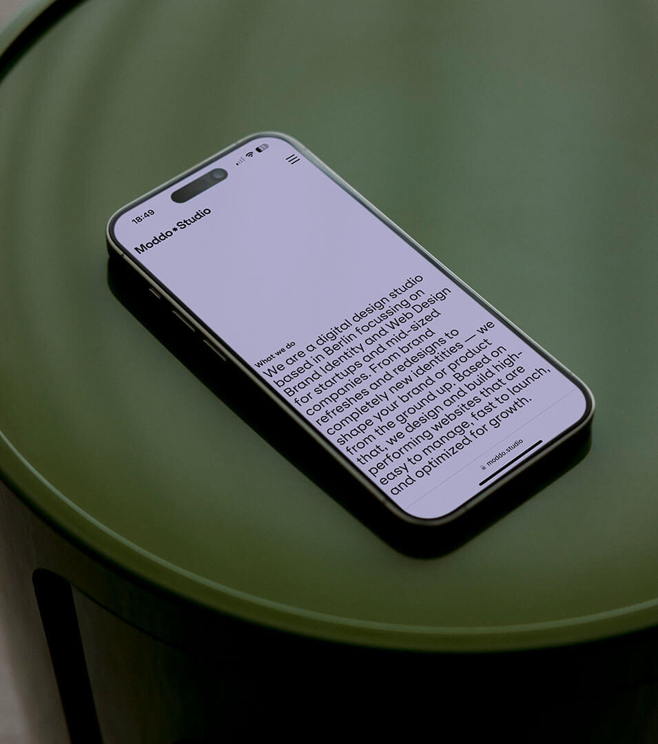
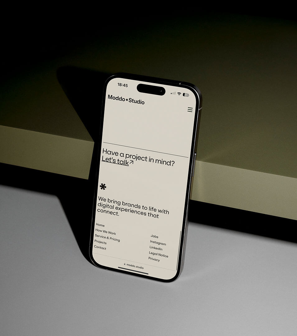
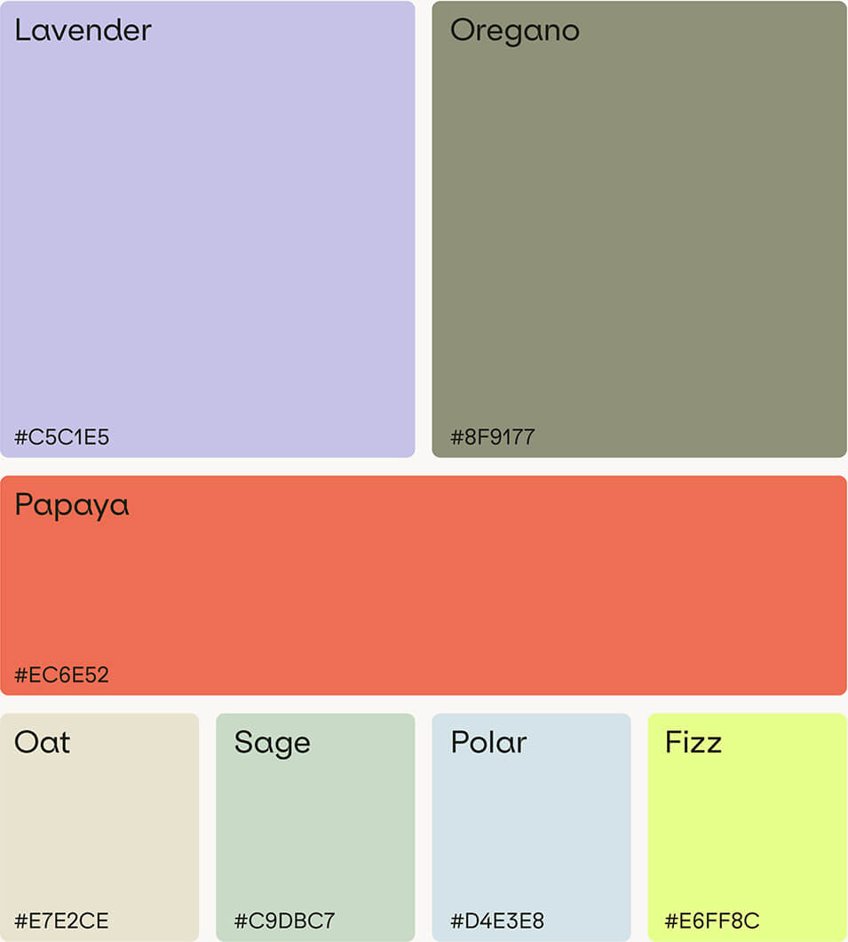
Industry
Digital Design Studio
Year
2025
Services
Branding
,
Webdesign & Development
A laptop showing the website of the client.
INTRO

Moddo Studio is a small design studio I started to help startups and small businesses build strong brands and functional websites.
Since I was both the client and the designer in this project, it was an opportunity to create something that genuinely reflects how I work and what I value.

I defined the studio’s own visual identity — a branding system that’s clean, confident, and flexible across all platforms. Here’s how I approached the logo, colors, typography, website and overall look to bring Moddo Studio’s personality to life.

The Logo
The logomark is clean and confident, designed for clarity and flexibility across formats. A key feature is the asterisk (*) placed between the two words.
The asterisk is more than just a symbol — it’s the core idea behind Moddo Studio.
It represents different things:
In code, it’s a wildcard — open, adaptable, and full of possibility.
In writing, it’s a footnote — pointing to something extra, something worth noticing.
It’s also a native part of digital language: simple, sharp, and familiar.
Placed between “Moddo” and “Studio,” it acts as a quiet connector — bridging concept and execution, structure and creativity, client and studio.
The clients logo.Business Cards
Color Scheme
Type
Website
I designed and built the website in Webflow, optimized for speed, clarity, and responsiveness. The layout follows a structured grid system, emphasizing big type, minimal animation, and strong visual hierarchy. I intentionally kept the motion and visual effects light to maintain focus on the content and reduce cognitive load. This reflects the core belief: form follows function, but function should also look damn good.

Key characteristics:
Large, confident typography that reflects our design voice.
Clean UI with generous white space and considered pacing.
Fast load times and seamless responsiveness across devices.
Clear information architecture that guides without overwhelming.

Every element — from the typographic rhythm to the hover states — was designed to feel intentional and effortless.
A laptop showing the website of the client.A laptop showing the website of the client.
More Projects

Check those other projects